
Designing Apps for iPhone Duo
Designing Apps for iPhone Duo
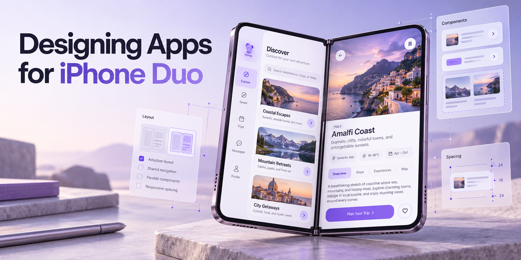
Introduction
Designing applications for iPhone Duo introduces new opportunities to create flexible, immersive, and intuitive user experiences.
This guide explores the design principles behind iPhone Duo and explains how to adapt existing iOS applications to its different screen sizes, orientations, and folding configurations.
The goal is to create applications that feel natural and consistent, regardless of how the device is used.
1. Understanding the iPhone Duo Form Factor
When closed, iPhone Duo is compact, familiar, and comfortable to hold. When opened, it reveals an expansive, immersive display that provides additional space for applications and content while maintaining the portability of a smartphone.
The device supports several configurations:
- Closed: A compact smartphone experience.
- Book Mode: A partially folded display resembling an open book.
- Laptop Mode: A partially folded device resting on a table, with the upper display facing the user.
- Standing Mode: A self-supporting configuration that rests on the device’s edges.
- Fully Open: An expanded display for immersive content and multitasking.
These configurations allow users to interact with applications in different ways depending on their environment and preferences.
Applications should adapt naturally to these configurations without requiring users to learn different navigation systems.
2. Designing for the Outer Display
When closed, iPhone Duo features a display that is wider and shorter than a traditional iPhone screen.
To maximize available vertical space, controls normally positioned at the top or bottom of the interface move to the right edge of the display.
This arrangement improves accessibility and creates an uninterrupted content area.
The vertical control region accommodates several interface components, including:
- Tab bars
- Application toolbars
- Navigation buttons
- Status information
- Dynamic Island
- Live Activities
The Dynamic Island expands vertically when Live Activities appear.
Moving these elements to the side creates additional space for content while keeping essential controls within comfortable reach.
The same design approach extends to the inner display, where controls can also move to the edges to maximize usable space.
3. Adapting to Folded Configurations
When iPhone Duo is partially folded, the display curves through its central region.
This curved area introduces challenges for readability and touch interactions.
To maintain usability, interface elements should automatically adjust their positions.
Text and images should move away from the central curve to improve readability.
Buttons and other interactive elements should shift toward accessible areas where users can interact with them comfortably.
The fold can also function as a natural visual divider between different sections of an application.
Portrait Orientation
When the device is partially folded in portrait orientation, interactive controls should move toward the lower half of the display.
This positioning improves accessibility while allowing the device to remain stable on a surface.
The objective is to preserve usability across different physical configurations without introducing unnecessary complexity.
4. Supporting Multitasking with Split View
iPhone Duo introduces a multitasking experience that allows two applications to operate side by side.
Users can drag an application toward the edge of the screen to activate Split View.
The display is then divided into two equal sections, each functioning independently.
This arrangement allows users to continue working in one application while interacting with another.
Control Placement in Split View
In Split View, application controls move toward the outer edges of the display.
For example, when an application occupies the left half of the screen, its controls appear along the left edge.
This arrangement keeps controls accessible while preventing them from interfering with the central folding region.
Applications should remain functional and responsive when operating within either half of the display.
5. Picture-in-Picture and Dynamic Resizing
Picture-in-Picture allows users to continue watching video content while interacting with another application.
On iPhone Duo, a video can be positioned at the top of the screen.
The active application automatically resizes vertically to occupy the remaining space.
When the device is partially folded, the video can expand to fill one half of the display.
Applications must therefore support dynamic resizing as available screen space changes.
Layouts should respond immediately to these adjustments without disrupting content or navigation.
6. Building Adaptive Application Layouts
Applications should accommodate different screen configurations without requiring a separate interface for every folding position.
The recommended approach is to focus on two primary size classes.
Compact Width
Compact width applies to the outer display.
Applications should prioritize efficient use of space, accessible controls, and clear content presentation.
Regular Width
Regular width applies to the expanded inner display.
Applications can take advantage of the additional horizontal space to display more information simultaneously.
Recommended Design Practices
Avoid relying on fixed screen widths, device-specific breakpoints, or measurements tied to a particular display.
Instead, build flexible interfaces using:
- Layout margins
- Horizontal safe area insets
- Adaptive containers
- Resizable interface components
- Size-class-based layouts
Applications that already follow these principles should require fewer adjustments to support iPhone Duo.
The fundamental objective is to make interfaces freely resizable.
7. Optimizing Hands-Free Experiences
Partially folded configurations create opportunities for hands-free interactions.
For example, when iPhone Duo rests on a table in a laptop-like position, media content can appear on the upper display while interactive controls occupy the lower display.
This arrangement is particularly useful for video playback and other media-focused experiences.
However, specialized layouts should preserve the same controls and general navigation structure available in other configurations.
Essential functionality should never depend exclusively on a particular folding position.
Users should be able to access the same features whether the device is open, closed, or partially folded.
8. Managing Vertical Controls
Most iPhone Duo configurations position application controls along the side of the display.
An exception occurs when the inner display is used in portrait orientation, where horizontal control bars remain appropriate because sufficient vertical space is available.
The vertical control region may also contain system elements such as Live Activities and status information.
When available space becomes limited, application controls automatically collapse into an overflow menu.
Toolbar Behavior
Existing toolbar controls can generally be mapped to the new layout.
Controls originally positioned at the top of an application move toward the upper portion of the vertical control region.
Controls originally positioned at the bottom move toward its lower portion.
Tab bars remain aligned with the bottom.
However, not every interface component should move to the side.
Wide elements, including text buttons and segmented controls, should remain within the navigation bar when they cannot fit comfortably in the vertical control region.
This approach preserves readability and usability.
9. Designing Asymmetrical Interfaces
Moving controls to the side creates asymmetrical layouts.
Traditional iPhone interfaces often center content relative to the entire display.
On iPhone Duo, this approach may cause content to overlap with side controls.
Most content should therefore be positioned relative to the available safe area rather than the full display width.
Using horizontal safe area insets allows this adjustment to occur automatically.
Full-Screen Content
Some interfaces can remain centered across the entire display.
This approach works particularly well for immersive visual experiences that do not require scrolling.
However, interactive elements must remain clear of side controls.
Combining Layout Approaches
Applications can also combine full-width visual elements with inset content.
For example, a background image or header can extend across the entire display while foreground content remains within a safe, scrollable area.
All interactive elements should remain inside the accessible content region.
This prevents controls from being obscured or becoming difficult to use.
10. Optimizing Applications for the Inner Display
The expanded inner display should offer more than a stretched version of a traditional iPhone interface.
Applications should use the additional space to improve navigation, content organization, and productivity.
Three approaches are particularly useful.
Approach 1: Split Views
Split views allow multiple levels of an application’s navigation hierarchy to appear simultaneously.
For example, a list of items can appear on one side while the selected item’s details appear on the other.
The underlying navigation hierarchy should remain consistent between the inner and outer displays.
Users should not encounter different functionality simply because the device has been opened or closed.
Approach 2: Adaptive Multi-Column Layouts
Applications can reorganize their content when additional horizontal space becomes available.
For example, a vertically stacked layout can transform into a two-column arrangement.
This approach is useful for applications displaying media, product collections, or structured information.
The content remains the same, but its presentation adapts to the available space.
Approach 3: Sidebar Navigation
Applications using tab bars can convert them into sidebar navigation on the inner display.
This approach is particularly effective for information-dense applications.
A sidebar provides persistent access to navigation categories while leaving more room for detailed content.
However, sidebar navigation is not necessary for every application.
The appropriate solution depends on the application’s information structure and user experience requirements.
11. Adapting Sheets and Modal Interfaces
Sheets also adapt to the different configurations of iPhone Duo.
On the outer display, sheet controls move to the side by default.
Developers can disable the vertical bar when the content benefits from retaining horizontal controls.
This option works particularly well for sheets containing only one toolbar button.
In this configuration, the sheet stops before reaching the front-facing camera, and the status bar adjusts its position.
Inner Display Behavior
On the inner display, sheets use standard horizontal bars in both portrait and landscape orientations.
When the device is partially folded, sheets shift away from the central folding region.
This prevents important controls from appearing in areas that are difficult to interact with.
12. Avoiding Interactive Elements in the Fold
The central fold can make buttons and other interactive elements difficult to tap.
To address this challenge, system components automatically reposition interactive elements when the device is partially folded.
This behavior is supported by components such as:
- Sheets
- Alerts
- Menus
- Toolbar buttons
- Other standard interface controls
Using native system components allows applications to benefit from this behavior without requiring extensive custom implementation.
The general principle is to keep interactive elements outside the curved region whenever possible.
Scrollable content, however, does not necessarily need to avoid the fold.
13. Maintaining a Consistent User Experience
Users may frequently open, close, and reposition iPhone Duo while interacting with an application.
The interface should respond smoothly to these transitions.
Navigation should remain predictable, and application functionality should remain consistent across configurations.
A user who begins a task on the outer display should be able to continue that task after opening the device.
Similarly, closing the device should not introduce unnecessary navigation changes or remove access to important features.
Adaptive design should improve the experience without making the application feel like a different product.
14. Key Design Recommendations
Successful iPhone Duo applications should follow several fundamental principles.
Prioritize adaptive layouts. Design interfaces that respond naturally to changes in available screen space.
Use size classes. Focus on compact and regular width configurations instead of device-specific dimensions.
Respect safe areas. Keep essential content and interactive elements away from system controls and difficult-to-reach regions.
Support flexible resizing. Ensure applications respond smoothly to Split View, Picture-in-Picture, and folding transitions.
Use native components. Take advantage of built-in interface behaviors, including automatic fold avoidance.
Optimize expanded layouts. Use additional screen space for multi-column content, split views, and sidebar navigation when appropriate.
Preserve consistency. Maintain the same core functionality and navigation hierarchy across all device configurations.
Conclusion
iPhone Duo introduces a new approach to designing applications for foldable smartphones.
Its combination of compact and expanded displays, flexible folding configurations, side-mounted controls, and multitasking capabilities creates opportunities for more adaptable user experiences.
The most effective applications will not rely on separate designs for every physical configuration.
Instead, they will use responsive layouts, native interface components, and consistent navigation patterns to adapt naturally as the device changes shape.
By embracing flexible resizing, thoughtful control placement, and adaptive content organization, developers can create applications that feel intuitive and fully integrated with the iPhone Duo experience.