
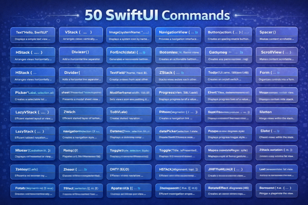
50 Essential SwiftUI Commands with Examples and Explanations
Basic Views
- Text – display a string of text
Text("Hello World") // shows text on screen- Image – show an image from assets or system
Image("logo") // displays image named "logo"- Button – interactive button with action
Button("Click") { } // button that triggers code- Spacer – pushes content apart
Spacer() // creates flexible empty space- Divider – thin horizontal line
Divider() // separates content with a line- Color – block of color
Color.red // fills area with red- Rectangle – simple rectangle shape
Rectangle().fill(Color.blue) // blue box- Circle – circular shape
Circle().stroke(Color.green, lineWidth: 3) // green outlined circle- Ellipse – oval shape
Ellipse().fill(Color.orange) // orange oval- Capsule – pill-like rounded shape
Capsule().fill(Color.purple) // purple pill shapeLayout Containers
- VStack – vertical layout stack
VStack {
    Text("A")
    Text("B")
    Text("C")
}- HStack – horizontal layout stack
HStack {
    Text("Hello World")
    Text("Hello World")
    Text("Hello World")
}- ZStack – layers content on top of each other
ZStack {
    Color.yellow
    Text("Top")
        .font(.title)
}- Group – groups multiple views
Group {
    Text("One")
    Text("Two")
    Text("Three")
}- ScrollView – scrollable content
ScrollView { Text("Scrollable") } // vertical scroll- List – dynamic scrolling list
List(1..<4) { Text("Row \($0)") } // list rows- Form – form layout for input controls
Form { TextField("Name", text: .constant("")) } // input form- Section – divides list/form into sections
Section(header: Text("Info")) { Text("Details") } // sectioned content- NavigationView – container for navigation
NavigationView { Text("Home") } // enables navigation- NavigationLink – clickable link to another view
NavigationLink("Go", destination: Text("Next")) // link to new pageInput Controls
- TextField – single-line text input
TextField("Enter text", text: .constant("")) // text box- SecureField – password input (hidden text)
SecureField("Password", text: .constant("")) // hidden input- Toggle – on/off switch
Toggle("Enable", isOn: .constant(true)) // switch control- Slider – sliding numeric value
Slider(value: .constant(0.5)) // slider 0 to 1- Stepper – increase/decrease value
Stepper("Count", value: .constant(1)) // step counter- Picker – dropdown or wheel selection
Picker("Choose", selection: .constant(1)) { Text("One").tag(1) } // picker- DatePicker – pick date and/or time
DatePicker("Select Date", selection: .constant(Date())) // date selector- ColorPicker – choose a color
ColorPicker("Pick Color", selection: .constant(.blue)) // color input- ProgressView – loading/progress indicator
ProgressView("Loading…") // spinner/progress bar- Link – open external URL
Link("Open Website", destination: URL(string: "https://kiaapp.xyz")!) // external linkModifiers (Styling)
- .font() – set font style/size
Text("Title").font(.title) // larger font- .foregroundColor() – set text or shape color
Text("Red").foregroundColor(.red) // red text- .background() – add background behind view
Text("BG").background(Color.gray) // gray background- .cornerRadius() – round corners
Rectangle().cornerRadius(10) // rounded box- .padding() – add spacing inside view
Text("Padded").padding() // padded text- .frame() – set width/height
Text("Boxed").frame(width:100, height:50) // fixed size- .opacity() – adjust transparency
Text("Faded").opacity(0.5) // 50% transparent- .shadow() – add shadow effect
Text("Shadow").shadow(radius: 5) // drop shadow- .bold() / .italic() – emphasize text
Text("Bold").bold() // bold text- .multilineTextAlignment() – align multi-line text
Text("Centered").multilineTextAlignment(.center) // center aligned🔹 Advanced Containers & Features
- TabView – tab bar navigation
TabView {
   Text("Home").tabItem { Label("Home", systemImage: "house") }
} // tab navigation- GeometryReader – access parent size/position
GeometryReader { geo in Text("\(geo.size.width)") } // get layout info- LazyVStack – efficient vertical stack (on demand)
ScrollView { LazyVStack { Text("Item") } } // lazy vertical list- LazyHStack – efficient horizontal stack
ScrollView(.horizontal) { LazyHStack { Text("Item") } } // lazy horizontal- LazyVGrid – vertical grid layout
LazyVGrid(columns: [GridItem(.flexible())]) { Text("Cell") } // grid- LazyHGrid – horizontal grid layout
LazyHGrid(rows: [GridItem(.flexible())]) { Text("Cell") } // horizontal grid- Map (via MapKit) – show a map
Map(coordinateRegion: .constant(MKCoordinateRegion())) // map view- VideoPlayer – play video content
VideoPlayer(player: AVPlayer(url: URL(string:"video.mp4")!)) // video player- WebView (custom) – embed a web page
// Custom wrapper required for WKWebView- Alert / Sheet – pop-up alerts or modal sheets
.alert("Title", isPresented: .constant(true)) { Button("OK", role:.cancel){} } // alert popup