
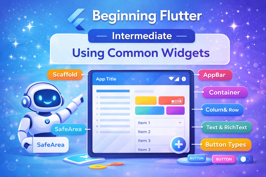
Flutter provides a set of core widgets that form the
foundation of almost every user interface you build.
These widgets act as the essential building blocks for
creating clean, functional, and visually appealing apps.
Understanding how elements like Scaffold, AppBar,
SafeArea, Container, Text, RichText, Column, Row,
and various button types work together gives you the
structure needed to design smooth and intuitive user
experiences.
The Scaffold widget is usually the starting point of a
screen. It establishes the basic Material Design layout
and allows you to easily add common interface
components such as an AppBar, floating action button,
drawer, snack bars, and bottom sheets. It serves as the
overall framework that organizes the page. The
AppBar, which sits at the top, typically includes a title,
a leading widget (often a back button or menu icon),
and action buttons aligned to the right. While the title
is often a simple Text widget, it can be replaced with
more customized elements like dropdowns. The
flexibleSpace property adds even more flexibility by
allowing background images or layered content behind
the toolbar.
On modern devices with notches or screen cutouts,
layout safety becomes important. The SafeArea widget
ensures that content doesn’t overlap with system UI
elements like the status bar or navigation areas. It
automatically applies padding where necessary and
allows you to control which sides should respect those
safe boundaries, helping maintain a clean and usable
interface across devices.
The Container widget is one of the most versatile tools
in Flutter. It allows you to style and position child
widgets with properties such as padding, margin, color,
alignment, borders, constraints, and transformations
like rotation or scaling. Sometimes, a Container is
simply used as invisible spacing to help structure a
layout.
For displaying text, the Text widget handles simple
strings with customizable styling options, including
font style, alignment, maximum lines, and overflow
behavior. When multiple styles are needed within the
same block of text, the RichText widget becomes
useful. By using TextSpan children, it enables precise
styling of different parts of a sentence, giving you
greater control over typography.
Layout arrangement relies heavily on Column and
Row. A Column stacks widgets vertically, while a Row
places them horizontally. Both take a list of child
widgets and offer alignment controls through
properties like mainAxisAlignment and
crossAxisAlignment. Wrapping children with
Expanded allows them to fill available space
proportionally, making layouts more responsive and
balanced.
Flutter also provides a variety of button types tailored
to different interaction needs. Elevated buttons
highlight primary actions, floating action buttons
emphasize key tasks, text buttons offer subtle
interactions, icon buttons provide compact controls,
popup menu buttons display additional options, and
button bars help organize multiple actions together.
Selecting the appropriate button type improves clarity
and guides user behavior effectively.
Together, these widgets form the core toolkit for
building modern Flutter applications. Once you
understand their purpose and how they interact, you
can confidently create structured, responsive, and
polished interfaces that feel natural to users.