
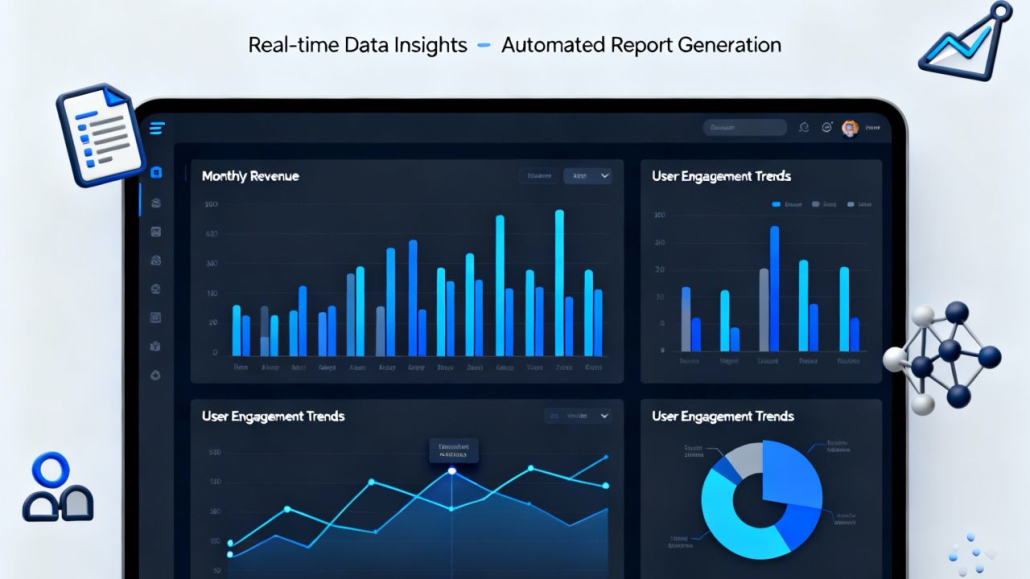
This image presents a clear and modern vision of how
businesses move from raw data to confident decisions
using AI-driven analytics. At the center is a sleek,
dark-themed dashboard displayed on a tablet-like
interface, immediately signaling professionalism,
control, and real-time awareness. The design reflects a
real-world business environment where leaders rely on
dashboards to understand performance at a glance,
rather than digging through spreadsheets or static
reports.
The charts shown—monthly revenue bars, user
engagement trends, line graphs, and a segmented pie
chart—represent different layers of insight working
together. Revenue data shows growth patterns over
time, helping decision-makers understand momentum,
seasonality, and performance changes. Engagement
charts reveal how users interact with a product or
service, highlighting peaks, drops, and behavioral
shifts that would otherwise remain hidden. Together,
these visuals communicate that AI analytics is not
about a single metric, but about connecting multiple
signals into a coherent picture.
The headline at the top, “Real-time Data Insights –
Automated Report Generation,” reinforces the core
message: insight is no longer delayed. Instead of
waiting for manual reports or end-of-month
summaries, businesses can see what is happening now.
AI enables continuous analysis, transforming live data
into structured insights without constant human
intervention. This shift from reactive reporting to
proactive awareness is one of the most important
changes AI brings to modern decision-making.
Supporting icons around the dashboard—documents,
charts, user symbols, and data structures—subtly
emphasize the ecosystem behind the interface. They
suggest that data flows in from many sources: users,
systems, reports, and external inputs. AI acts as the
connective tissue that brings these sources together,
cleans the data, identifies patterns, and presents only
what matters most. The result is clarity instead of
overload.
Visually, the clean layout and balanced composition
suggest trust and usability. The interface does not feel
overwhelming, even though it contains complex
information. This reflects an important principle of
practical AI: complexity should exist behind the
scenes, not in front of the user. Decision-makers should
feel supported, not intimidated, by the tools they use.
Overall, the image communicates a powerful narrative
about modern business intelligence. Data alone is no
longer enough. Value emerges when data is translated
into insight, insight into recommendations, and
recommendations into action. This dashboard
represents that final step—where AI helps businesses
move confidently from numbers to decisions. It shows
a future where leaders are better informed, teams are
more aligned, and decisions are based on evidence
rather than intuition alone.